
One pagers can be a great selling tool, but what does it take to make an effective one pager? What even is a one pager?
We sat down with Angela Sun, who created a B2B Sales 2-Pager Template to get her advice. She not only shared what she thinks makes a good one pager, but helped us evaluate and grade One pagers from various companies. While layout and look are important, Angela says that the copy is what makes a prospect want to learn more.

Name: Angela Sun
Position: Freelance Marketing Consultant & Copywriter
What’s Your Background? I’ve spent the last decade in various marketing roles at B2B tech companies ranging from Seed stage to Series B. A guiding principle I’ve always lived by when it comes to my work is: How can I be most helpful? This has landed me in a few roles “accidentally”, based on what needs there were on the marketing team at the time. It’s the reason I started out in Marketing Operations (because our team had purchased Pardot Marketing Automation and no one really knew how to use it yet 😅) and how I found myself in Product Marketing roles most recently.
Now, I consult on a full-time basis for B2B tech startups because I love solving those early startup marketing challenges and working closely with founders.
Fun fact about yourself: During the pandemic, I got really into writing songs! I found out that one of my friends was learning music production at the same time, so we joined forces and recorded a couple songs that we put up on YouTube. It was so fun and fulfilling to get to exercise that creative muscle. Another fun fact: My brother’s girlfriend submitted this childhood photo of us to AwkwardFamilyPhotos.com and it briefly got turned into a meme by Buzzfeed circa 2011. 😐
First off, what in your mind makes a good one pager?
Like any marketing or sales asset, it needs to get in front of the right person at the right time (with the right message!), so how you use it is pretty important. I’ve been at companies where we had our SDRs share a 2-pager in a cold email to get a meeting, and this tactic had…minimal success. Sending it after an initial discovery call as a recap or “leave behind” piece for your prospect to share internally with stakeholders would probably be a more appropriate use. Usage aside, I would say a good one pager has to check a few boxes from a design and copy standpoint.
Your design and look-and-feel are the first impression you give off. Subconsciously, your reader is thinking: “Do I want to give this thing I’m looking at any more of my time?”. A well-designed one-pager has:
- Clean layout
- Even margins
- Good use of color (not too many, otherwise it’s distracting)
- Consistent use of font (again, not too many different fonts)
- Product imagery that’s clear to understand and also big enough to see
Your copy is what gets your reader interested and hooked on learning more. If design grabs attention, copy gets engagement. A great one-pager with thoughtful copy has:
- A clear, concise value proposition and benefits (so your reader can instantly know if your product is for them or not)
- Word(s) that describe the thing you sell (e.g. software, dashboard, platform, membership plans, etc.) As readers, we need this context to anchor our understanding of what it is you offer.
- Social proof in the form of a quote or customer logos
- Call-to-action
- BONUS: If you can speak to why the status quo is no good or why other solutions fall short, and explain how your product is better, this helps to solidify your position in the market.
To Put Angela To The Test, We Decided To Have An Informal ‘Grading’ Of One Pagers To See What She Thought Was Good Or Bad
First up, a One Pager from the Product Marketing Alliance:
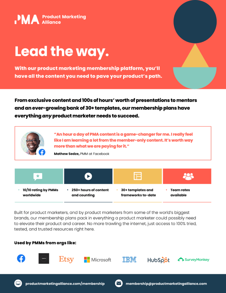
Angela: Right away, I love the layout and the colors. It uses the same font, so it’s not distracting in any way, and visually just looks awesome. There’s enough margin between the sections that it’s not cramped. I see the quote first, and the logo after (which has great brand recognition) and it does a good job of giving social proof with someone at Facebook – that’s a great brand.
Nick: And with just enough photorealism.
Angela: Yes! It’s always a struggle when you try to balance graphical and photo images in one page.
Nick: There is a lot of text on this page, but you don’t notice that. I like that it’s not overwhelming with its use of imagery. Like, everything’s like a little bit toned down my, and they use very unique iconography that I don’t necessarily know what it is but it doesn’t distract.
Angela: I like the call to action at the bottom too: to get involved, email or go to the website – makes it super clear and it doesn’t take up a ton of space too.
Nick: It’s funny you bring up the call to action. The bad thing here for me is that I think the deliverable here is a little unclear. For instance, this guy mentions an hour of PMA content today, which to me feels like a lot. I understand that’s the quote they’re using, but like, I think a negative here is.. what am I buying? A package? Am I buying coursework? To your point, I know where to go. I would’ve liked a little bit more detail on like, even in that second sub bullet of what I’m actually getting.
Angela: I see that, but at the same time I do like the four quick hit boxes. At a high level you really do know a bit about what they’re offering. The full call to action and what you’re getting here is a bit unclear, but I would say this is A minus territory.
Nick: Yes, I strongly feel this is an A minus. As a one pager, it’s perfect, but I’m lacking definition on the deliverable product that I’m buying.
Final Grade: A-
Next up – a One Pager from our library, describing our product Enablix Learn:
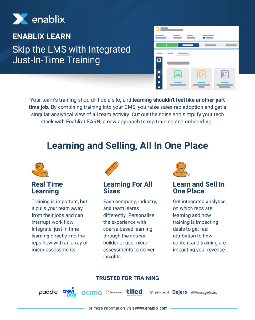
Angela: I like this sentence, “By combining training into your CMS, you raise sales rep adoption and get a singular analytical view of all team activity.” You’re telling the reader a little bit about what you do, but also like what you can get out of this product, and it’s really succinct in that one sentence.
Nick: That’s exactly what we tried to go for here. The product name “Enablix Learn” tells you a little about it, but because the space we operate in commonly uses the acronym LMS, then if you’re not familiar with what that is then this one pager isn’t giving you enough information. So this right here, in the first two sentences, we have to tell you exactly what you’re getting in industry specific language.
Angela: I was going to say, I don’t know what an LMS is, but I’m also probably not the buyer for this. I like the overall layout, I feel like it’s clean. “Learning and selling all in one place” I might move that up to the subtitle and swap the “skip the LMS…” sentence to the middle. What does “just in time” training mean?
Nick: That’s a good question, and if you don’t know what that means, then we have not done our job here. And now we’ve gotten to the second or third thing that is not just broadly understandable.
Angela: I like the three like value props with a little more description underneath, and I actually have that in my template. You’re teeing up the problem here, which is great because that isn’t always clear. The headline “Learn and Sell” is great, but the body is talking about reporting and metrics, so maybe align these value props a little bit differently.
Nick: I also think here if we look at the reading difficulty of this one – This is like three grade levels harder than the PMA one-pager and you have to read it a couple times to get what it’s saying.
Angela: I feel like the value prop of what you guys are offering is clear and it’s actually a really cool solution. I was thinking, I want to see what this actually looks like. But, this image looks like a dashboard, maybe in Salesforce, but it’s hard to tell because of the design here.
Nick: It’s supposed to be Enablix inside Salesforce, but to your point, I think it’s very busy and so more simplicity or full screen shots on the next page might make it easier to understand how this works.
Angela: Yeah I feel like the language is clear, the value prop is clear. I would just want to know what this looks like and how my reps would interact with it. I think I’ll give it a B+.
Nick: I think we did a lot of right things here, but we’re also expecting you to know a lot going into it, whereas PMA’s didn’t.
Angela: These sales one or two pagers are so hard because you never know who is going to be looking at it or where it’s being forwarded off to. So it gets difficult to pack a lot of information into these.
Final Grade: B/B+
Lastly, a One Pager from ayeQ:
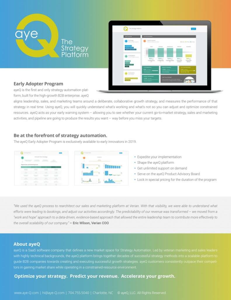
Nick: The other ones we’ve looked at had a second heading, but this one has nothing aside from “The Strategy Platform” heading. So real quick, we’re going into the text and and unlike the PMA one, it’s kind of hard to read.
Angela: First impressions, overall, I like the color gradient they use here and I actually feel like it’s pretty well designed. There is a lot of text, but the bullets and layout make it easy on the eyes. There’s a quote for social proof and the photo at the top helps me understand what they’re offering. It’s definitely software and this one pager has that look.
Nick: Personally, I don’t love the image inside a laptop design, I think it’s very 2014. But I think you’re right that having a bigger image there that’s trying to say something is a really good direction. Overall, I like the consistent fonts, bullet points, social proof, and it’s an attractive page layout design.
Angela: One thing I will say is that I’m struggling to understand who this is really for because it is so broad. They mention leadership, sales and marketing, that’s 3 departments… so who is actually buying this?
Nick: Yeah, I don’t understand entirely what it’s for. I think they took a stab at trying to say what you’re getting, but it’s so small in the middle of the page there. That’s my big thing for this whole one pager, everything is too small. The fonts are too small, the pictures are too small.
Angela: One thing I wanted to call out that I thought was interesting is the last sentence in that first paragraph “way before you miss your targets.”
Nick: There’s a lot of ways to do that messaging, but this makes it sound like you’re missing your targets already.
Angela: Yeah that messaging is a little negative so I probably wouldn’t lead with that. Maybe rephrasing to something like “So you never miss your target”
Nick: To our point earlier, I think they have great social proof there, but it’s losing effectiveness because it’s so hard to read.
Angela: This quote is pretty long. 3 sentences is pretty lengthy, but I would play with some formatting like bold certain keywords or something to make this stand out more to have a greater effect.
Nick: I feel like that’s the theme of this one pager, is that there’s so much that I’m not getting anything. And then to your point about the last one, no clear call to action. Enablix’s had limited, PMA’s had a lot, but this just has a non-hyperlinked website and a phone number.
Angela: I do like the layout and the colors, it gets me to at least look at this and read it. So it catches my attention. The differentiating factor is definitely missing here though, like why would I pick this over something else? I’m going to give this one a B.
Nick: I think if I understood what it was doing, it would get a B. It’s gotta be B minus for me, only because I don’t understand what the deliverable is or what it’s doing.